
Designing a Better Campus Marketplace
Why Students Struggled to Use This Marketplace
What does it take to design a marketplace students actually trust and want to use?
TIMELINE
15 weeks
ROLE
Product Designer
OVERVIEW
This project showcases the design of a campus marketplace app aimed at simplifying student transactions. UX evaluation and usability testing highlighted critical usability challenges. The resulting design improvements focus on creating a more intuitive and efficient end-to-end experience.
INTRO
When Move-Out Week Hits
End of the semester always turns into the same situation, stuff everywhere and no easy way to get rid of it. Things like microwaves or storage bins that someone else could definitely use, but selling them feels like more effort than it’s worth. Between unreliable platforms and awkward coordination, it’s easier to just toss things or give them away.
That’s when it clicked, why doesn’t a better campus marketplace already exist?
That question stuck with me. I remember sitting in class, thinking about what kind of everyday problem I could actually solve, something that would make life easier for people around me. With a push from my professor to reflect on my own experiences, I realized this wasn’t just a one-time frustration. It was a shared problem across campus, and the perfect opportunity to design something better.
user InterviewS
We Took the Question to Students!
To better understand how students currently buy and sell items, we conducted interviews with 12 students around Collegetown. We focused on their experiences using platforms like Facebook Marketplace, eBay, and Depop, as well as how they handled buying and selling during the end-of-semester rush.
While we expected a range of different experiences, a clear pattern quickly emerged, many students shared the same frustrations!

INSIGHTS
Buying and Selling on Campus Is Broken by Trust and Friction
By synthesizing interview findings using an affinity diagram, we uncovered consistent themes across participants.
Trust is Nonnegotiable
Students are highly cautious due to past scams and unreliable platforms, and look for verified users, secure transactions, and clear seller credibility before engaging.
Communication needs to be fast, not noisy
Users want quick, direct messaging with buyers and sellers, but dislike spam or irrelevant messages that make interactions feel overwhelming.
Price must match perceived quality
Students constantly evaluate whether an item is worth its price and prefer ways to verify condition, often favoring in-person inspection before purchasing.
Convenience drives decisions
Mobile-first, easy-to-use platforms with simple navigation and efficient flows are essential, as students prioritize speed and minimal effort when buying or selling.
Sustainability matters—but not at the cost of convenience
While students are aware of waste from “dump-and-run” culture, most won’t prioritize sustainability unless it’s easy and doesn’t disrupt convenience.
Market Gap?
Existing Marketplaces Weren’t Built for Students
You might be thinking, why build a new marketplace when so many already exist? Between Amazon, Facebook Marketplace, and eBay, there’s no shortage of places to buy and sell. And while these platforms offer convenience, wide selection, and basic trust systems, they weren’t built with students in mind.
In our research, we found that these solutions only solve parts of the problem.
Trust is inconsistent,
Communication can be overwhelming or unreliable, and
None are truly designed for fast, local, student-to-student exchanges.
This gap revealed an opportunity: a marketplace designed specifically for campus life, one that is simple, trustworthy, and built for the way students actually buy, sell, and pass things on.
PROBLEM STATEMENT
Upperclassman at Cornell University who lives off campus and actively participate on the buying and selling of pre-owned and homemade goods in Ithaca require a seamless and secure platform that ensures clear communication between parties and offers a convenient experience for transactions because they are deeply concerned about the risk of scams and fraud, the quality of pre-owned items, and prioritizing cost-effectiveness and convenience.
Brainstorming
Cooking something up…
Once the problem felt real, we didn’t jump straight into solutions. Instead, we started laying everything out, what already exists, what frustrates people, and what would actually make this worth using. We sketched different directions, from improving trust through reviews and profiles to making coordination easier with built-in chat and scheduling, and even explored ideas like smart negotiation and reward systems to make the experience feel more engaging.
Here are some of the different directions we thought of . . .

As ideas evolved, we began thinking less about features in isolation and more about how everything connects, how someone goes from discovering an item to actually completing a transaction without friction. That shift helped us move toward a more cohesive system, where browsing, communication, trust, and incentives all work together to create a marketplace that feels simple, reliable, and built for students.
Design concept
From Marketplace to End-to-End Exchange System
At its core, the product centers around one idea:
make peer-to-peer exchange feel as easy, safe, and rewarding as buying something new.
We broke the experience down into key moments:
Finding the right items
Evaluating if it’s trustworthy
Communicating with the seller
Coordinating the exchange
Reflecting on the transaction
Following these principles we began optimizing for:
local relevance (campus-only environment)
trust visibility (profiles, reviews, verification)
low-friction coordination (chat + scheduling)
behavioral incentives (rewards for sustainable actions)
Here is a quick peak at our design concept sketch!

The final concept is not a single feature, but a combination of tightly connected ones:
A search and filtering system that helps users quickly find affordable and eco-friendly items
A built-in messaging and smart negotiation system that simplifies communication and pricing
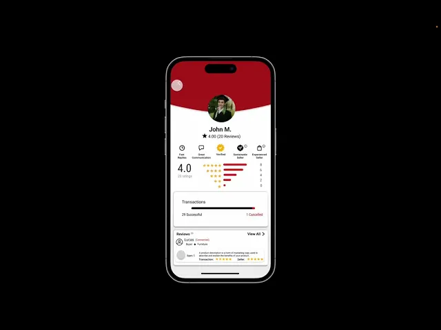
A transparent seller profile and review system that builds trust before a transaction happens
A structured scheduling flow that removes the back-and-forth of coordinating meetups
A reward system that encourages sustainable behavior and repeat engagement
A review loop that feeds back into trust and future decisions
Usability testing
Simplicity Wins: Designing for Understanding
To validate our medium-fidelity prototype and uncover real usability issues, we conducted structured usability testing sessions focused on how users naturally interacted with BigRedTrade. Our goal was not just to observe whether users could complete tasks, but to understand how they thought, where they hesitated, and what broke their mental model of the app.
We designed our sessions around a realistic scenario-driven workflow to simulate how a student might actually use the platform—from discovering a product to completing a transaction.
We used a think-aloud protocol, encouraging participants to verbalize their thoughts, confusion, and decision-making in real time. This allowed us to capture not just what users did, but why they did it.
Across sessions, several patterns consistently emerged that revealed gaps between our design intentions and user expectations:
1
Core actions were not always intuitive
Users struggled with basic interactions like searching and filtering. For example, some participants were unsure how to type into the search bar or didn’t realize it was interactive, leading to hesitation and repeated tapping.
2
Important features lacked visibility
The Smart Negotiator—one of our key differentiators—was frequently overlooked. Users either didn’t notice it or were unsure how it worked, limiting engagement with a core feature.
3
Inconsistent UI created confusion
Differences in button styles, unclear icons, and ambiguous labels (e.g., filters, badges, or “edit” functions) caused users to pause and question their actions.
4
Lack of feedback and control reduced confidence
Users expected clearer system responses—such as confirmation messages, the ability to undo actions, or feedback during interactions like messaging and rating. Without these, users felt unsure if their actions were successful.
The biggest takeaway from usability testing was that clarity and visibility matter more than feature complexity. Even though we introduced advanced functionality like Smart Negotiation, users could not benefit from it unless it was:
Easy to find
Easy to understand
Clearly responsive
This shifted our design focus from simply adding features to making interactions obvious, consistent, and intuitive.
Final solution
BigRedTrade
BigRedTrade is a mobile marketplace designed for Cornell students to easily buy, sell, and exchange items within a trusted community.
NEXT UP


